There are many scripts for toki pona.
Since there are so few words in the language, logographic scripts are the best, in my opinion. My preferred one is the sitelen pona, which, thanks to its simplicity, can be very easily learned, written and read. Actually, its shapes are so easily recognized that I can understand the text probably faster than written in the latin script, because the meaning of a word and also the structure of a sentence is clear immediately, without actually reading them in the toki pona (similarly to Blissymbolics).
The sitelen sitelen, on the other hand, is so cool and beautiful, that it is a pleasure to play with.
Thanks to toki pona's very simple phonology, almost any alphabet, abugida, syllabary, etc., can be used very effectively. By default, the latin alphabet is used, and it works, but also cyrillics, korean Hangul, etc., are fine. So why would anyone invent another one?
Well, it is fun. Plus, I had a feeling, that toki pona could use its own phonetic script. The logographic ones do not carry the phonetic information, and one has to apply various tricks to write non-standard words, names, etc. I saw several apriori invented scripts, but the reasons for using them were weak. They were just mangled alphabets.
I personally was inclined to use something very simple and intuitive. My favorite was Hangul, in my opinion THE best writing system. Its characters are mnemotechnically shaped - they symbolically represent the position of mouth and tongue while producing a particular sound. They can be learned in very short time - like in an hour or so.
However, for toki pona, Hangul is actually unnecessarily powerful and more complex than necessary. Plus, I wanted to be able to form one glyph for one word - so the structure of a sentence would be easily decipherable on the first glance. I did not want to reproduce the typical alphabet style of a linear writing (for that latin is good).
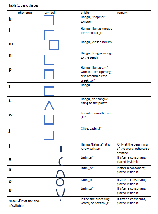
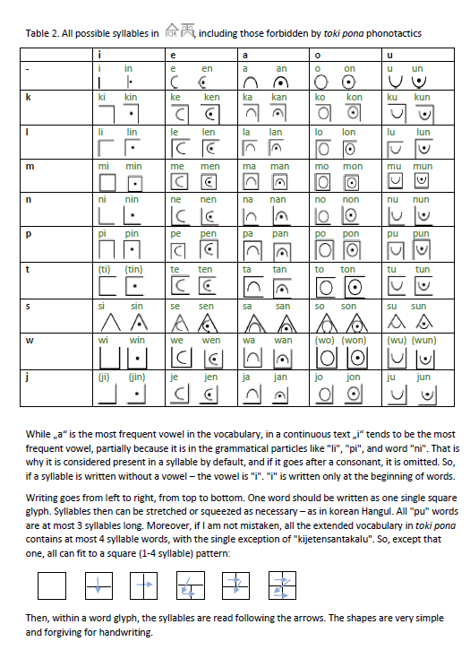
So, inspired by Hangul, I designed very simple shapes for the 9 consonants, based mostly on the shapes of mouth. Then I added simple shapes for 5 vowels. By combining those, a simple set of possible syllables can be defined (similar to the sitelen sitelen syllabary). Then, up to 4 syllables can be combined in one glyph to represent one word (similar to Hangul, where, however, up to only two syllables are typically combined in one glyph).
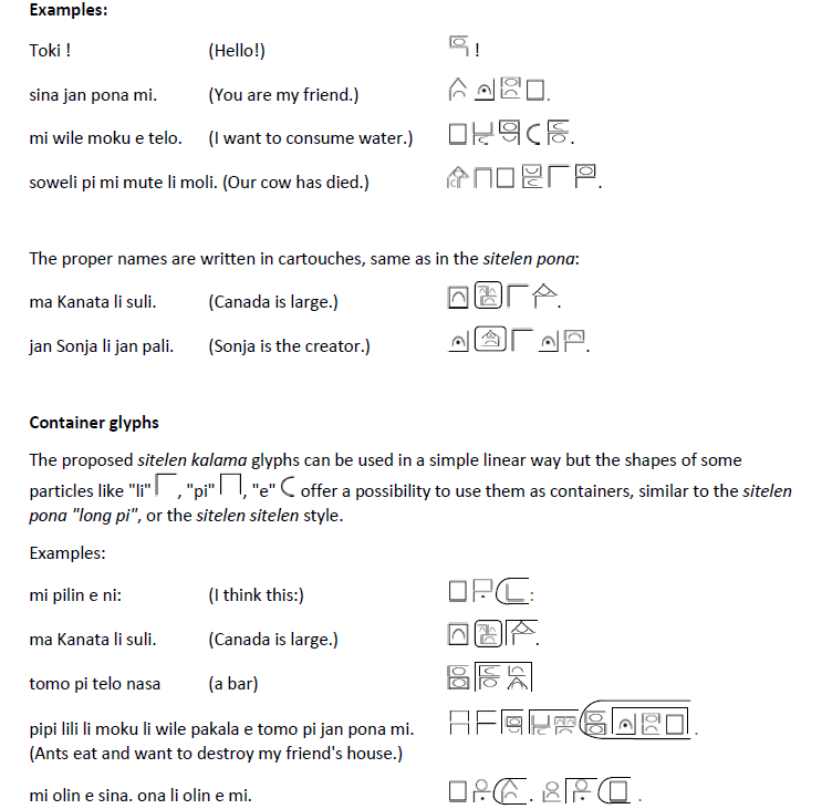
And so, toki pona sentences can be written in these word glyphs, which carry also the phonetic information, and are (in my opinion) very easily learnable.

Personal remarks:
My feeling is that the glyphs are easily written, understood, and fun to read. The shapes are simple, so they allow for a lot of variation of handwriting (like Hangul). The characters here seem to be very straight and rectangular, but it is only because it is easier to draw them this way on the computer, they do not have to be like that.
A disadvantage is that since it is an apriori script, it is not easily written on a computer (for now).
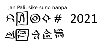
here will come the whole vocab